The Adapt Brand
Brand Guidelines & Downloads
This page is meant to be a resource and provide guidance for everything you need to represent Adapt’s identity accurately, including our logos, colors, and guidelines for communicating our brand.
Adapt is a next-generation media localization company, blending advanced AI technologies with human expertise to create authentic, culturally resonant content for global audiences. Our brand stands for innovation, collaboration, and inclusivity—empowering creators and audiences worldwide to experience media in any language, without compromise.
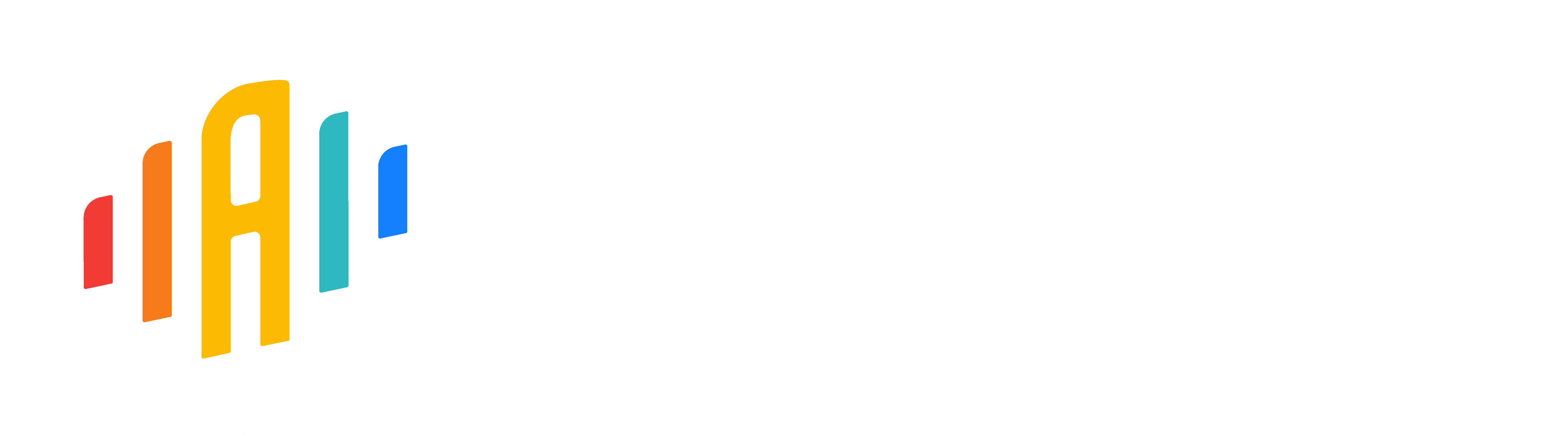
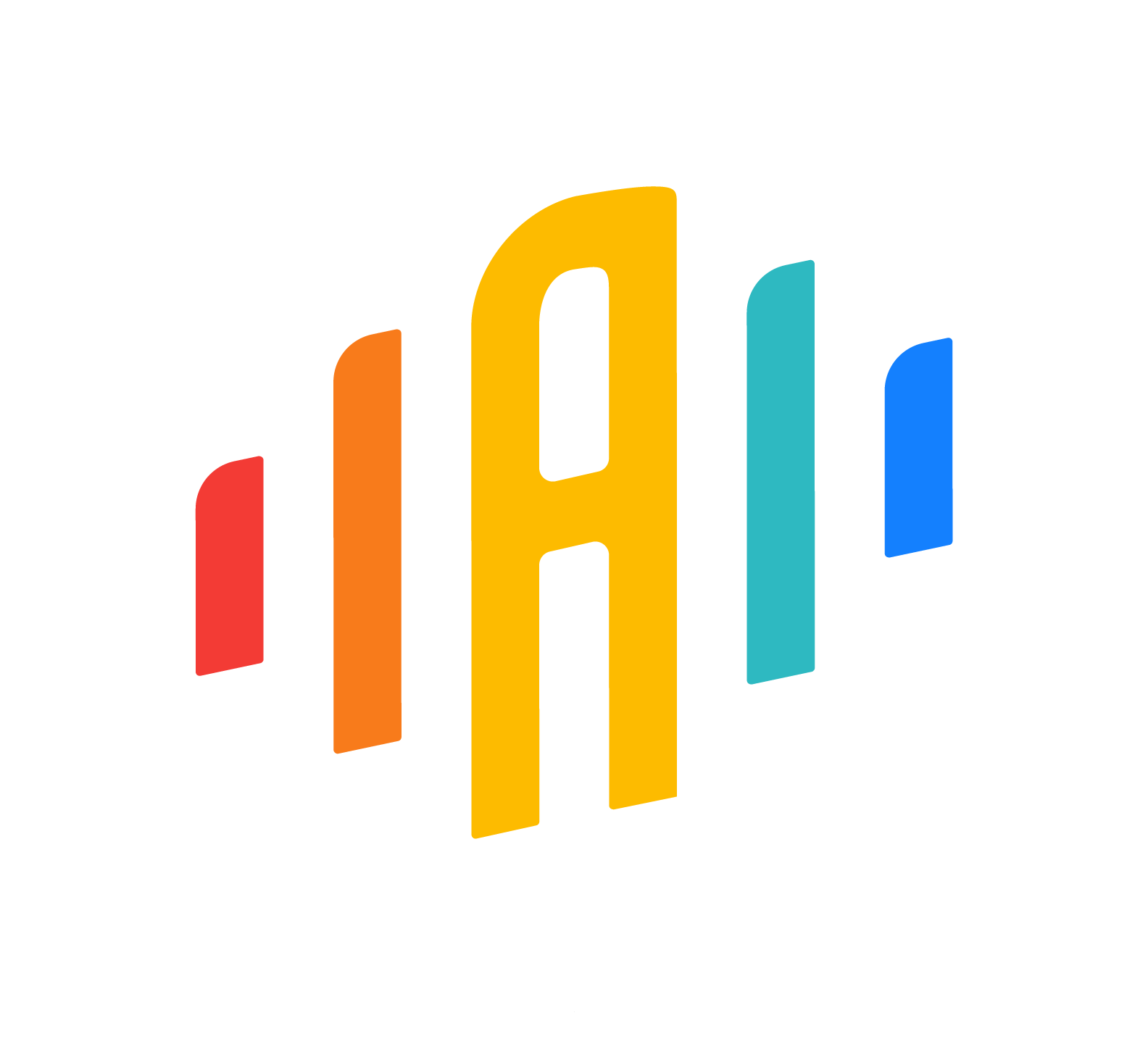
Logo
Our logo reflects our mission to connect the world through seamless localization. Use the primary logo whenever possible.
Alternate versions (horizontal, vertical, mark) are provided for flexibility in different contexts.
Primary Logo
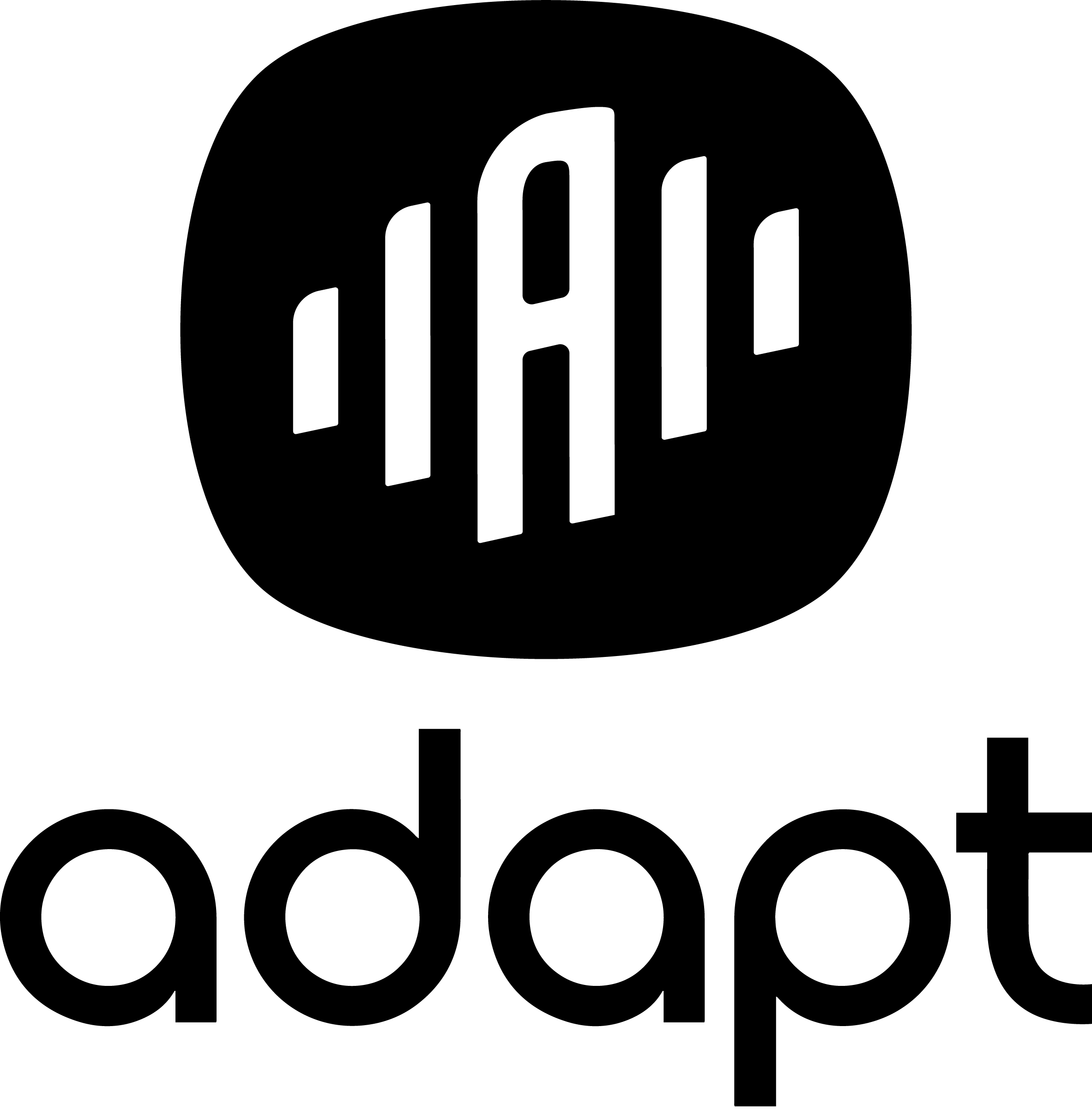
Secondary Logo


Logo Mark


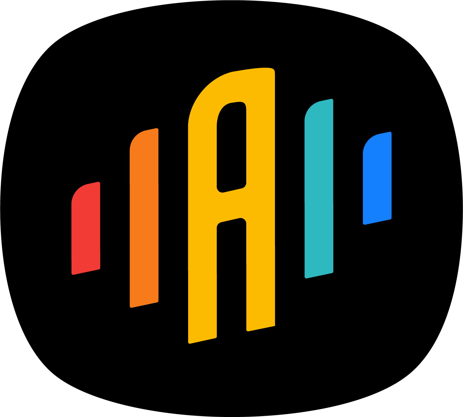
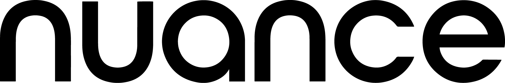
Nuance Logo


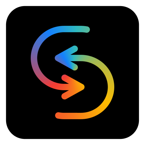
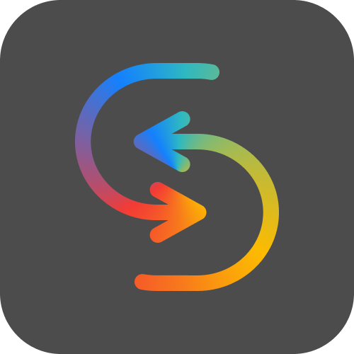
RealSync Logo


RealSync Marker
What to Avoid

Don’t apply color to logo

Don’t apply affects to logo

Don’t apply outline to logo

Don’t stretch or deform logo

Don’t rotate logo

Don’t clip or crop logo